|
|
Post by Ted Talks Stamps on Nov 21, 2023 1:32:21 GMT
My Bergedorf #4 is the one at the top. The one below it is the reference "genuine" stamp from stampforgeries.com Mine appears genuine in almost all respects -- if you go only by the reference image. Mine differs in two respects: it doesn't have the blob of ink above the E in BERGEDORF, and the two dots above the R in DREI are spaced farther apart. However, looking at the genuine full sheet shown on stampforgeries.com -- and it's a shame the individual stamp images are so small -- it does not look like every stamp on the sheet shows thoe blob or the dots in the same way. The tiny stamp image at the bottom is from the genuine full sheet. It's hard to tell for sure, but it sure seems as if it too is missing the top blob, and the two dots above the R appear to be spaced as mine are. I welcome opinions.    |
|
|
|
Post by khj on Nov 21, 2023 4:41:13 GMT
I believe you have a proof. In the proof, the 2 dots at left are on opposing sides of the dividing line. Also, the large vertical "dash" above the 2nd E in BERGEDORF is much less pronounce in the proof and mostly at or above the top dividing line.
|
|
|
|
Post by ClassicPhilatelist on Nov 21, 2023 4:58:50 GMT
Are you sure Kim?
Usually proofs have a cleaner appearance then the actual stamp. This is very muddy.
|
|
|
|
Post by khj on Nov 21, 2023 7:10:27 GMT
Good point, which is typically true for US and other countries where stamps were printed from metal plates. The numerous specks and dirtiness of the top stamp did make me wonder. The Bergedorf issues were printed from stone plates, so you will see the quality vary somewhat according to position. I'm wondering if the two stamp pics were scanned at the same resolution. But to me, Ted's example has finer lines, even though the block letters and colored edges don't see that sharp. The florals definitely show more details and the castle brick lines finer in Ted's example.
The proof suggestion was just an initial thought on my part. I don't have time now, but I'll try to dig up some proof & trial color examples tomorrow to compare. Your point is well raised and further discussion/examples is warranted.
|
|
|
|
Post by Ted Talks Stamps on Nov 21, 2023 10:13:43 GMT
Here is the proof shown on stampforgeries.com. When I was doing my comparison’s, this one at first had me convinced I had a match, but on continued inspection I thought otherwise. I’m not sure, now, why I eliminated it, maybe because of the two dots on the left. The paper color of the proof (insofar as you can trust the colors of two different scans) matches more closely.  |
|
|
|
Post by khj on Nov 21, 2023 16:51:29 GMT
Thanks for hunting down the pic, Tedski! It's not obvious in the pic you showed, but if you blew it up bigger, you will find the 2 dots at the left to be on opposing sides of the dividing line (like in your top pic in OP) as opposed to both being between the dividing line and frame line (as in the bottom pic in OP). That's actually what made me think it might be a proof.
The greater uncertainty I had (which is why I said "I think"), is whether it might be a trial color proof/essay. I don't know how to distinguish between the features among those. I think the only other pic I had was a grayscale pic. I'll need to dig it up.
|
|
|
|
Post by khj on Nov 22, 2023 5:36:42 GMT
|
|
|
|
Post by khj on Nov 22, 2023 5:39:17 GMT
I'm not sure why, but in the proof the dividing lines seem to be much closer to the stamp. Given that, the spacing between the 2 left dots on your stamp still don't match well in terms of absolute position.
|
|
|
|
Post by khj on Nov 22, 2023 5:48:27 GMT
From Ron's forgery blog (original proof left, proof center, forgery right): 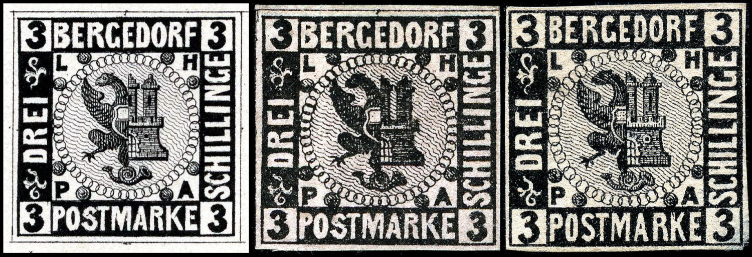 Looks like the pic is in grayscale. But the left 2 dot positioning/spacing in the original proof at left seem to match what you have? This is already beyond what I know, since I don't collect proofs or color trials/essays. Maybe you can ask Ron his opinion? |
|
|
|
Post by Ted Talks Stamps on Nov 22, 2023 16:28:09 GMT
I will do that.
|
|
 Ted Talks Stamps - The Forum


