|
|
Post by Ted Talks Stamps on Sept 3, 2023 18:48:34 GMT
Wikipedia says, "Frank Hitchcock, the Postmaster General, deemed the original designs for the 3-cent, 50-cent and 75-cent denominations unsatisfactory, delaying the issue of those values until after the first of the year."
Just curious if a record of these rejected designs exists, and, if so, does anyone know where they can be viewed.
Also, same question for these smaller designs: "By March the Postmaster General was considering using different colors for the individual stamps, and a smaller, definitive-sized design (for which plates of the 1 cent, 2 cent and 5 cent denominations were even engraved)."
|
|
|
|
Post by khj on Sept 3, 2023 19:41:14 GMT
Not sure what the references are for the Wikipedia article (haven't read), but it seems off? The original designs for the 3c and 50c parcel post (as well as some other denominations) can be found in the Scott US Specialized essay section as Q3-E1 and Q10-E1. The claim about the 75c, I believe is either in error or a typo. There is a unused initial 5c design, as well as other denominations. Regarding the "smaller design" of definitive-sized stamps, I believe this refers to the design later used for Documentary Revenues. A set of 8 were engraved for 1c-50c, and the essays are listed as Q12a-E1 through Q12h-E1. If you don't have access to a US Scott Specialized (I realize some go through this Amos boycott stage in their philatelic life  ), let me know I can supply snippets.  k (who now posts here first instead of elsewhere so you won't already have the answer!) |
|
|
|
Post by ClassicPhilatelist on Sept 4, 2023 5:31:20 GMT
Ted, khj is on the right track here yes. The original design for the Q3 (3c) is illustrated as Essay Q3-E1 which has a postal truck backed up against a rail car. The adopted design by Hitchcock is the Q3-E3 which has a postman standing the door of the box car that was used to service the location. 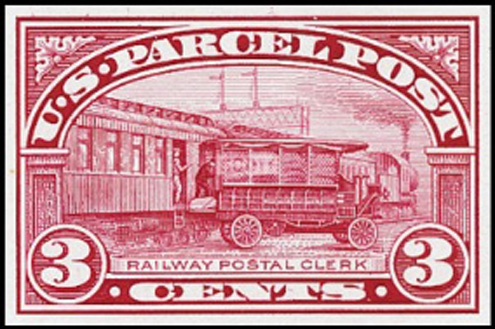 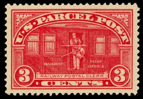 The Q3-E1 is at left above, and the Q3 final 3c design is at right.   The Q3-E10 is at left, while the Q10 final 50c design is at right. I think the author of the aritcle you read has it wrong as well actually. The 75c Essay and design are virtually identical, as seen in these images:   With Q11-E1 at left and Q11 75c design at right. However the $1 designs differ as do the 3c and 50c from the E1 essay submissions. These images:   with Q12-E1 at left and Q12 $1 Dollar design at right, indicate significant variance in design. However, it is interesting to note that the design offered here is "Manufacturing" and the $1 design adopted is "Fruit Growing". The essay for Manufacturing appears as 25c, 50c and $1 denominations, for which 25c was adopted. 50c became Dairying and $1 become Fruit Growing. Lastly, the definitive that was considered was similar to a typical Postage Due stamp of the time, with a similar plain design:     If the Essay colors chosen are any indicator of the color variations (and given the final Essays were printed in the carmine color used in the final stamp, so this is a reasonable expectation), the final denominations and colors would have been: 1c - Green 2c - Carmine 3c - Deep Violet 5c - Blue 10c - Orange Yellow 15c - Gray 20c - Carmine Rose No denominations above 20c were presented for consideration for parcel post. The Parcel Post essays are all incredibly scarce. The CV ranges from $1,500 (for the Q12(sub) Varieties to $5,500 for several of the Qx-Ex designs, with most around $4,000. One final note about the Parcel Post stamps, the 20c Aeroplane Carrying Mail stamp has the distinction of being the first stamp anywhere in the world to depict an airplane on it. Hope that helps. -S |
|
|
|
Post by Ted Talks Stamps on Sept 4, 2023 10:09:55 GMT
khj @classicalphilatelist you guys rock. Thanks for the great info. The bit about the unused designs was referenced to King, Beverly; Johl, Max (1935). The United States Postage Stamps of the Twentieth Century, Volume III. H. L. Lindquist.
|
|
|
|
Post by ClassicPhilatelist on Sept 4, 2023 10:11:08 GMT
I added a few more of the small denomination essays that I dug up. Sorry, I don't have 2c, 3c or 20c.
|
|
|
|
Post by Ted Talks Stamps on Sept 4, 2023 10:15:55 GMT
khj, you are right, my Amos boycott is a phase that will eventually pass. After all, I’m sure they now regret having raised the ire of Ted the Talking Stamp Collector and are hard at work making amends.
|
|
|
|
Post by khj on Sept 4, 2023 14:44:51 GMT
Complaining about Amos is sure sign how much you love them. That's a corollary to what my wife tells me after she finishes...
|
|
|
|
Post by khj on Sept 4, 2023 14:47:33 GMT
The bit about the unused designs was referenced to King, Beverly; Johl, Max (1935). The United States Postage Stamps of the Twentieth Century, Volume III. H. L. Lindquist. Thank you. I should have that volume and will check it. I did take a look at the Wikipedia footnote and supposedly it's discussed on pp143-145. |
|
|
|
Post by ClassicPhilatelist on Sept 4, 2023 14:52:53 GMT
I'm with Ted... Have boycotted Amos since the "subscription-only" option. Though I continue to have access to my previous digital editions, so I continue to use them.
|
|
|
|
Post by Ted Talks Stamps on Sept 4, 2023 15:17:23 GMT
I added a few more of the small denomination essays that I dug up. Sorry, I don't have 2c, 3c or 20c. Great. Thanks. |
|
 Ted Talks Stamps - The Forum


 ), let me know I can supply snippets.
 k (who now posts here first instead of elsewhere so you won't already have the answer!)


